E-Commerce Cart Component Redesign
A targeted component cleanup and UI modernization for a high-traffic e-commerce cart operating within BigCommerce theme constraints.
As a solo UX designer, I undertook a focused component redesign of 4ocean’s shopping cart. Operating within the layout and technical limitations of a modified BigCommerce theme, the goal was to streamline item management, improve mobile scannability, and modernize the visual hierarchy for key actions without rebuilding the entire checkout platform.
By restructuring the cart item layout, increasing product image prominence, and clarifying the visual hierarchy of primary actions and payment methods, we can reduce cognitive load and make it faster for users to review, modify, and progress from their cart on both desktop and mobile viewports. From here, we can evaluate whether targeted component-level updates (improving scannability, item management controls, and payment visibility) successfully lower user effort and streamline the transition from cart review to checkout within the existing BigCommerce template framework.
Key Focus Areas & Constraints
Technical Constraints: Worked around rigid template structures in BigCommerce to update core UI modules safely.
Component Modernization: Refined product image presentation, spacing, and item-management controls to reduce visual clutter.
Payment Visibility: Reorganized payment option hierarchy to make secondary payment methods easier to evaluate at a glance.
Interact with motion timing, latency curves, and live code directly on CodePen / Figma.
▶ LAUNCH INTERACTIVE PROTOTYPE ↗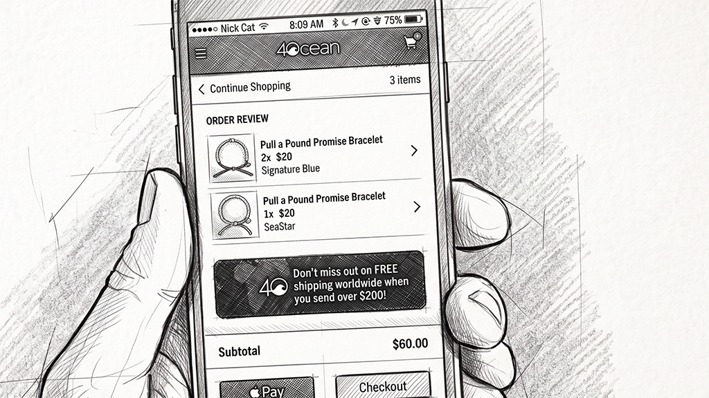 [ CLICK TO VIEW HIGH-RES SPECIMEN ↗ ]